BREAKING THE 4TH WALL - Hollywood Bowl - October 6th 2027
THEME & SUBJECT: My dream concert is based around the idea of bands who only exist within the context of their movies/TV shows decide to break out of their movies (hence the title) and come together to put on a concert for their fans in real life. They are tired of being confined to a screen. I am trying to convey strong characters through the bands, a feeling of exciting nostalgia for many film geeks, and a hint of irony through the venue choice.
LETter of intent
The bands that I have in my lineup are: Main Acts:
-Josie & The Pussycats (Josie & The Pussycats)
-Stillwater (Almost Famous)
-Sex Bob-omb (Scott Pilgrim vs The World)
-Dr Teeth & The Electric Mayhem (The Muppets)
-Spinal Tap
Ft. Special TV bands:
-Mouse Rat (Parks & Recreation)
-Dr Fünke’s 100% Natural Good-Time Family Band Solution
(Arrested Development)
The requirements in choosing these bands were that they cannot have performed or produced music outside of their movie and are live action, not animated.
For design choices, I want to stay away from using the cliche film camera/movie theatre screen/film strips to represent these bands. Rather, to represent the fiction base, I want the design of the website to feel over the top/exaggerated/outrageous. For the home page, I tried to make it function like a menu screen of a DVD (where there’s a slideshow, animation, and a large scroll over nav box).
My date proposal brings in the theme of bands joining together against the restrictive movie industry to breakout into the music business. This concert will be taking place on October 6th, 2027 because that is exactly 100 years from the release of The Jazz Singer, the first film with sound. On the same day music entered the film world, these film bands break out into the real world. Unfortunately, this is a Wednesday.
The concert will be taking place at the Hollywood Bowl. Coming out of the movies with a big breakout concert, it makes sense for the bands to play at an established, iconic concert venue. The Hollywood bowl fits the concept perfectly because it overlooks Burbank and Universal studios. This is both ironic in that the concert is still connected to the film industry in a way, but also symbolic in that the venue is “above” the studios.
The audience for this concert is not small, but not outrageous. In comparison to some concerts that may seat 100,000 people, the Hollywood Bowl’s capacity is 17,500. The audience is primarily composed of film geeks who worship the people they see in movies. In addition, I imagine people who are fans of these films and their soundtracks would attend as well for a chance to see them perform live.
RESEARCH
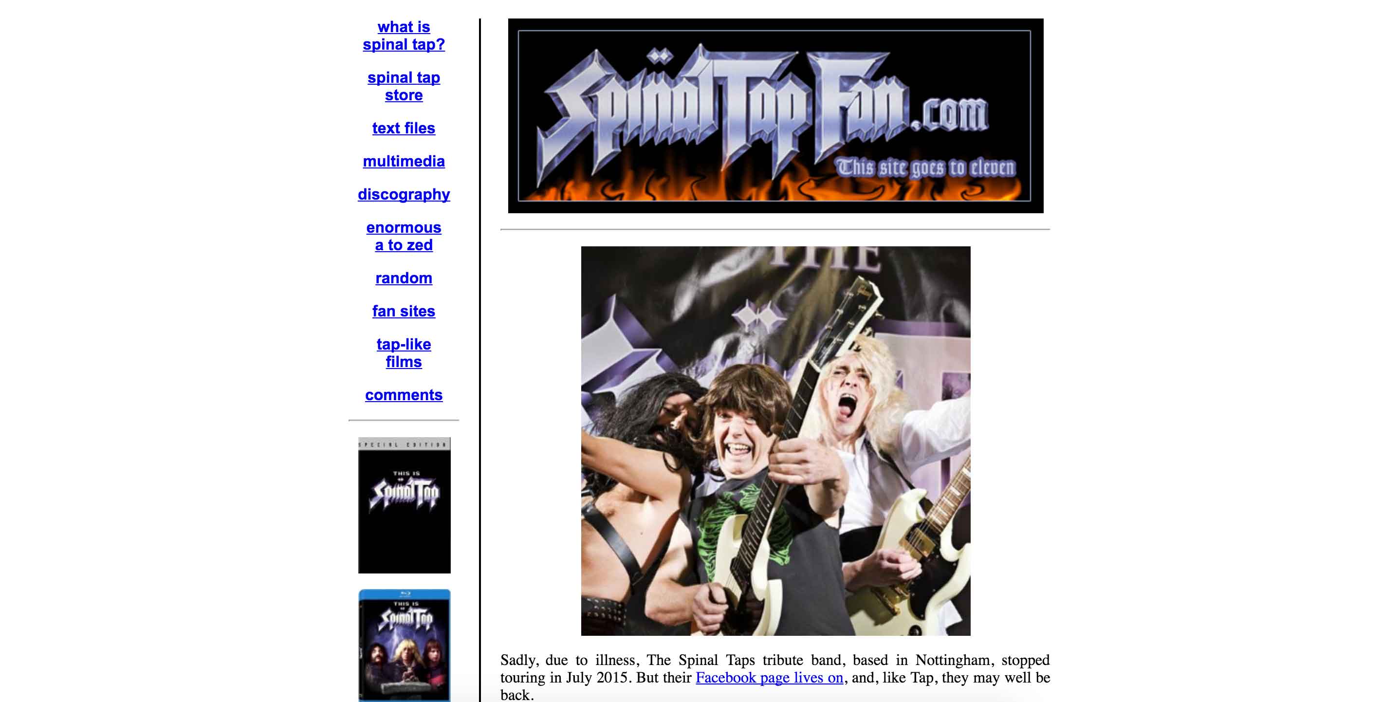
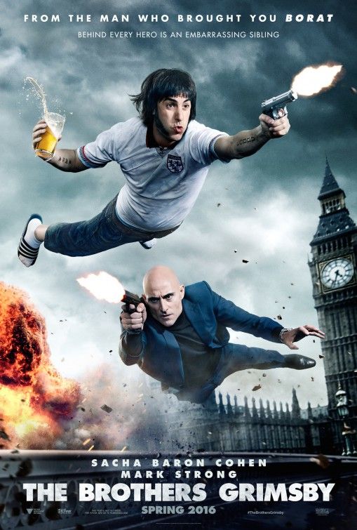
Concert site inspiration - because my bands are not real, they don’t have concert websites. I then searched for websites for their movies, but since most of them are older nothing came up. (Except for spinal tap. Unfortunately shown below.)
From there, I looked to artists not included in my lineup for inspiration.
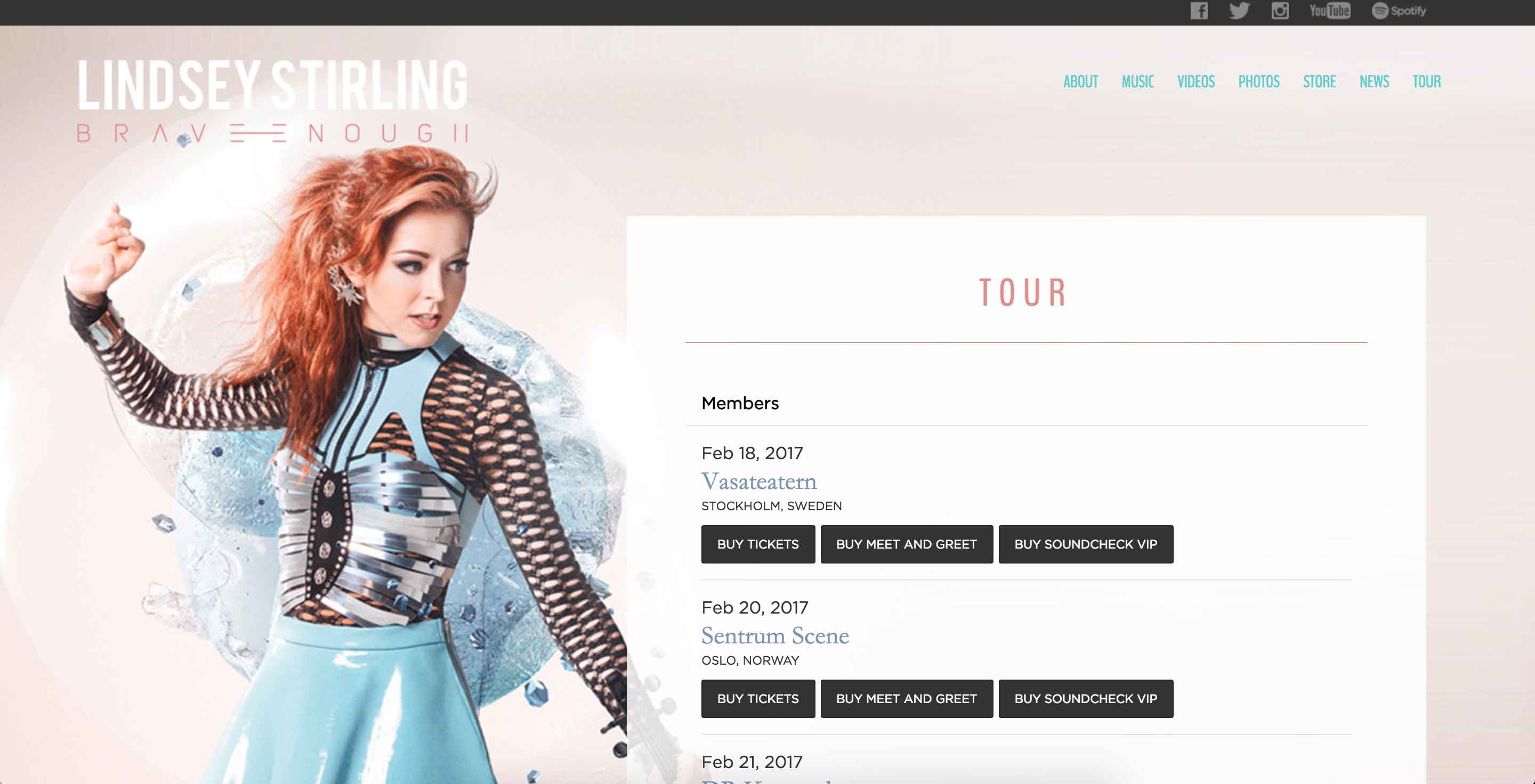
This is Lindsey Stirling’s Brave Enough Tour site. I have been here before and looked to it for it’s simple, but illustrative design. I really liked the footer from this site and thought that a version of it would add professional detail to my site. I also liked the no-scroll background because it felt like it would allow me to have a background image without it needing to repeat.
Dvd screen inspiration -
Going along with my “dvd menu screen” concept for the homepage layout, I looked into other film’s old, and a bit tacky, menus for my primary inspiration.
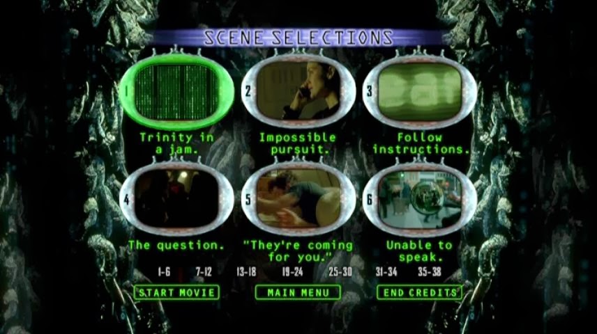
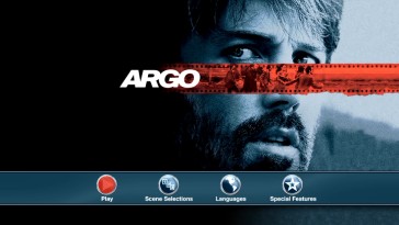
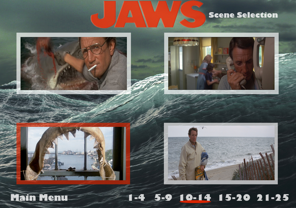
I like how classic each of these looked. I wanted to incorporate the basic elements that could be found without to make my website easily identifiable as a replica of this style. This includes the language of “scene selection,” “main,” and “play,” as well as pattern/image background, blocks around sections, and hover color changes.
Movie poster inspiration -
For the poster, I wanted to make it a mashup of a movie poster and a concert poster. This posed a challenge because movie posters are primarily photo based, while concert posters tend to be more text based.
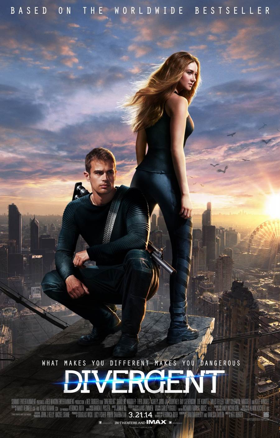
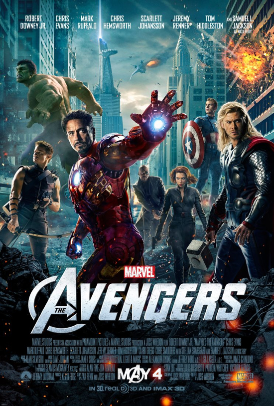
I decided to take the primary elements of these movie posters - image of “main characters,” names listed near the top, and large title closer to the bottom.
Concert poster inspiration -
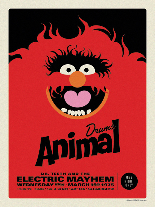
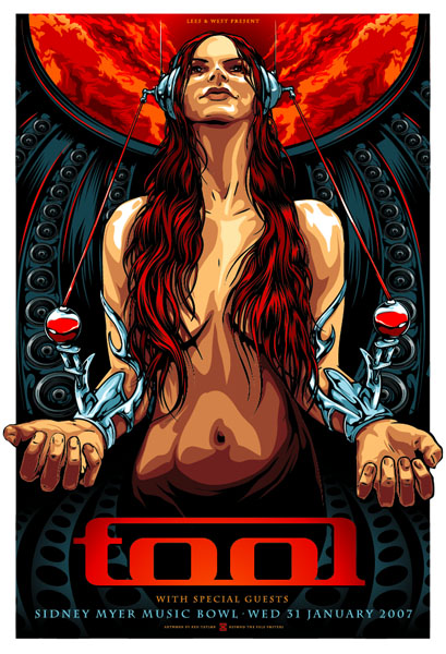
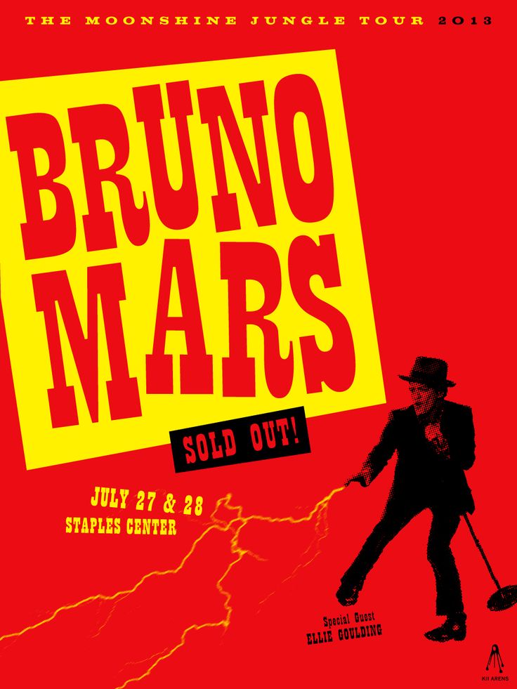
The concert posters I found were very graphic. From these concert posters, I decided to incorporate a large graphic element through the logo design and also posterize the photos to make them feel more illustrated.
Design
My design choices are a cross of influences from old dvd screens and colors/shapes that remind me of rebellion.
COLOR PALETTE:
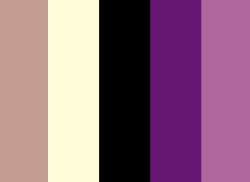
I chose this color palette because red felt too strong. The different variations of purple in contrast with both the black and tan/yellow felt like the perfect balance. Using this color palette, I was able to create consistency throughout my website by photoshopping every photo using the lighter purple as a photo filter.
FONTS:
Feast of the Flesh (logo)
Bangers (headers)
Oswald (body)
WIREFRAMES:
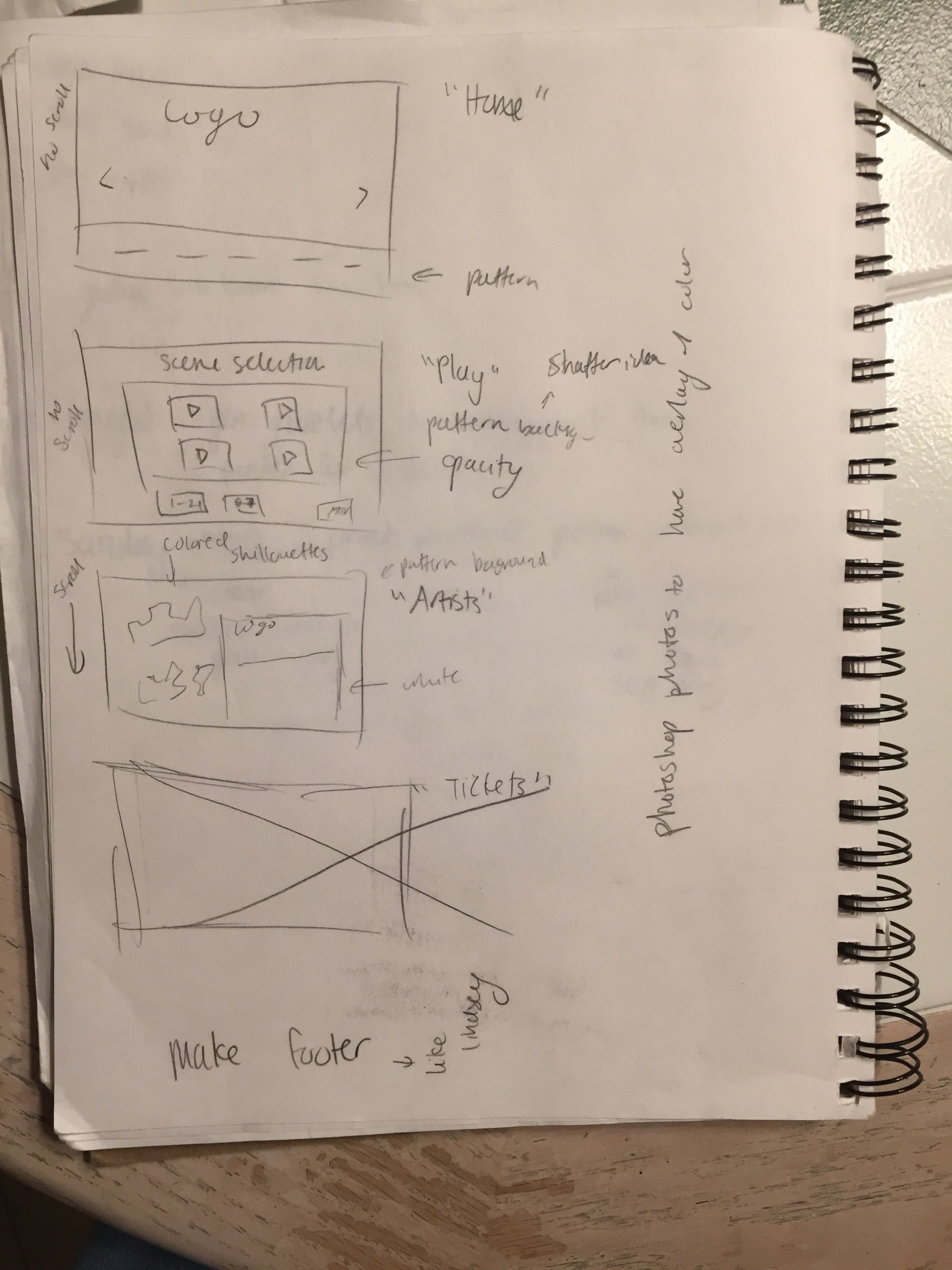
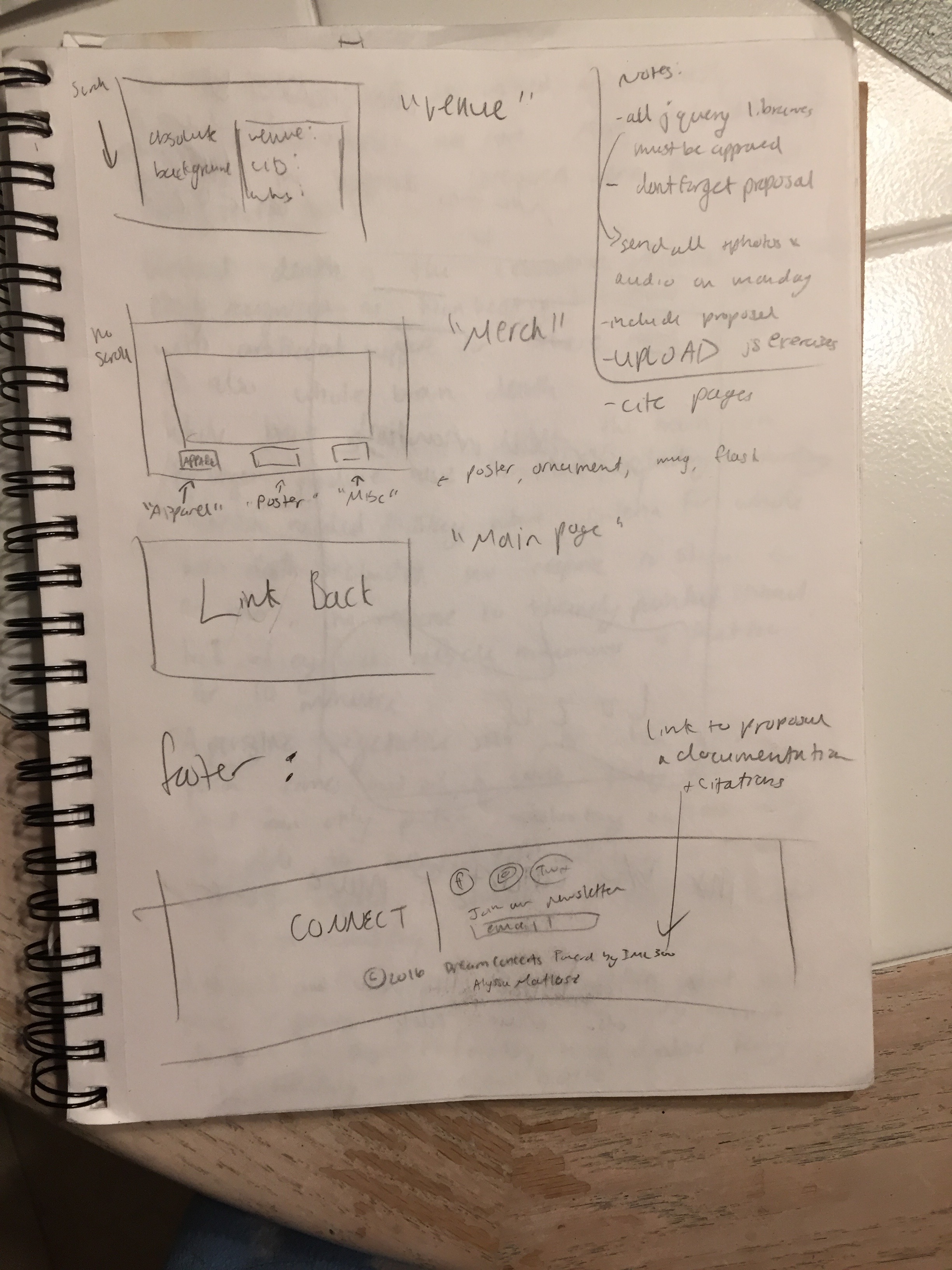
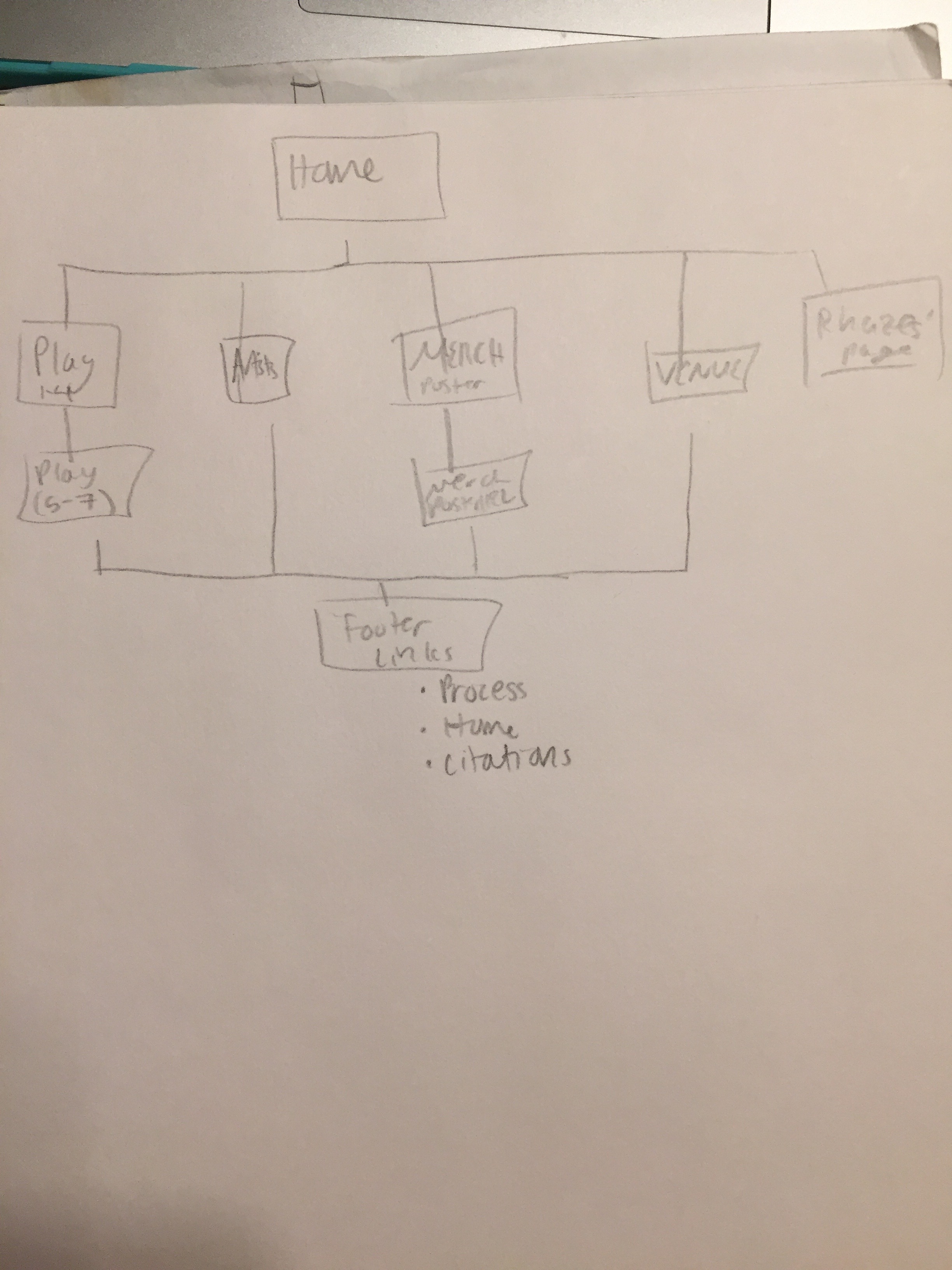
For my layouts, I decided on 3 different wireframes - homepage, play/merch, and artists/venue.
The homepage acts as the primary menu. This is the most recognizable layout for my theme. I wanted it to have an open feel, with the large slideshow as the primary element. The play/merch layout mimics a ‘scene selection’ menu. I wanted it to feel like a purposeful grid. There is a textured background as seen in the research section. The design is composed of columns and rows to frame where each album/image fits. The larger light purple box acts as a frame.
The artists/venue page layout is less like a traditional menu screen, but I kept the feel consistent with the boxes for text and header/footer. As with the homepage, I wanted it to feel more open. With only two columns, only one of which is visible on the venue page, I think my design achieves this.
Scope
My site includes 5 pages
- Home
- Play (sample tracks)
- Artists
- Merch (poster + on location + download)
- Venue
Site Map: